Montag, 13. Januar 2014

Collages, Collages

I have finally finished a number of collages for our drawing class and would now like to present them to you! I have created two series, the first being directly inspired by the work of Max Ernst, about whom  wrote in my last post.
Here they are:


Both include more or less direct references to Ernst, the first in form of a Victorian wood engraving, the second in form of a quasi 'headless' woman as a reference to his 'Hundred Headless Woman'. The first collage is also of course a take on mythology, connecting Egyptian beliefs with images of the moon (The type in the centre is German and says 'The Moon – Sensualised portrayals of this celestial body that is the closest to us').
The second collage was inspired by travels through the Balkans and its richness in landscape and culture, but also its troubled past. When I was there I was particularly fascinated by the way East and West coexist and mingle over there – mosques next to churches next to synagogues, moorish carvings in the midst of soviet concrete blocks. That is why I included Arabic newspaper type and old Italian stamps.

The second series I created was inspired by one of my favourite poems, 'The Love Song of J. Alfred Prufrock' by T.S. Eliot. I decided to make illustrations for the last three lines, because I find them so evocative: 'We have lingered in the chambers of the sea / By sea-girls wreathed with seaweed red and brown / Till human voices wake us and we drown'. 


This time, I have decided to colour code the images and include fewer of my drawings. As you can see, this did not result in a lack of texture! I am especially happy with how the last one turned out, because it is a more abstract spin on Eliot's poem, while the first to a fairly straight-forward illustrations. To me, 'Prufrock' is a take on modern life and isolation and I found that a cityscape was a good way of portraying this.

Collage Inspiration: Max Ernst

Max Ernst is without a doubt my favourite collage artist, and an influential one, too: Amongst his admirers were artists as famous as Joseph Cornell (another favourite collagist of mine). Ernst was a man of many talents, a proficient painter and printer next to his acute gift for collaging.
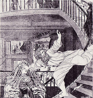
I admire his work because of the way he used established images to create something utterly new and unexpected. He was partly famed for collages he created from 19th century illustrations, most of them wood engravings, which he cut and pasted to create the most surreal scenarios. This act of reinterpretation and recontextualisation is in itself an achievement, but Ernst was a storyteller, too: He calls his collections 'surrealist novels' and to flick through, trying to make connections between the images, is a great pleasure.
Here are a few examples from 'The Hundred Headless Woman':


Sonntag, 13. Oktober 2013

Indian Ink Inspiration II: The Web

After the first ink experiments I was curious to see what other people had done with black ink. I was also interested in how others had used these 'manual' techniques in a digital environment, for instance in web design, and/or in how far the internet could aid me in the use of black ink patterns.
I quite like how Ink+Mortar Design combine water colour, black ink and and a digital typeface in their website banner:

It serves to show how well manual mark making/handwritten fonts can go hand in hand with a modern sans serif typeface, which gives it a professional touch. 

I also stumbled across the online portfolio of a designer called Colin Brewer, who has a blog in which he explores different mark making techniques, using black ink amongst other media (http://www.inkyhands.co.uk/). Here is some of his work, a mixture of type experiments and landscape studies:


Start with type Detail of "Loosen the fuck up"

Careful deliberate interruptions Inkyhands detail


Ink drawing of trees in the landscape

A wet day in winter

View across a wet Wollaton Park

As you can see, Brewer has experimented on a number of different levels, including the wetness of the paper he was using and the amount and density of ink on the brush. The outcomes are varied and interesting. Brewer writes: "I began this blog site to practice how to 'look' again in the form of observational studies". Thus, using these manual techniques and a medium as traditional as black ink helps him to return to the basics - to 'look again' after having his eye shaped and influenced by his work as a graphic designer. 

Last but not least, I found a useful resource for the lazier designers amongst us: On http://graphichive.net/Free/Graphics/ free vector-based files can be downloaded and the page includes black ink marks, too:


GOMEDIA-INK, INK-POINT VECTOR


GOMEDIA CHUPIN TEXTURE VECTOR
Although I like these patterns and marks very much and I think they could come in handy if you are stressed for time, I strongly recommend trying to create your own. Not only is it fun, it usually turns out in ways you never could have anticipated and will often inspire you in a totally unique way!


Freitag, 11. Oktober 2013

Indian Ink Inspiration: Leonard Baskin

Using Indian ink to create a number of textures and images was great fun and it proved to be a very versatile medium. Unsurprisingly, it also happened to be one of the preferred materials of one my favourite visual artists: Leonard Baskin. Baskin (1922-2000) was an American printmaker and sculptor and I first came across his work because he collaborated with poet Ted Hughes on numerous occasions, whose writing is one of my special academic interests.
The two famously devised a brilliant collection called 'Cave Birds', a truly collaborative piece (sometimes Baskin would illustrate poems by Hughes, sometimes the latter based his writing on the printmaker's drawings). Its interplay between word and image is fascinating and, I think, especially interesting to graphic designers for this reason, but it also demonstrates the power of black ink. 'Cave Birds' features 29 black and white drawings of demonic bird creatures and the number of different textures and patterns Baskin was able to come up with using just the one medium is astonishing.
Have a look at the following examples (please note that the copyright does NOT belong to me):


Baskin managed to create both clean black surfaces and intricate detail (and everything in between!), impressions of stillness just as well as movement and drama. Fantastic!
His other work is also very interesting and demonstrates his great skill of combining intricate detail with great simplicity.


Sonntag, 6. Oktober 2013

Indian Ink


Hello! And welcome to my blog. This space will serve to explore different mark making techniques and their respective advantages to get a better understanding of the physical tools I have at hand as a visual artist and designer. This first post is an investigation into the versatility of Indian ink. I hope you enjoy it!


This effect was created by placing a blot of ink on an A3 sheet of paper and then splattering it by blowing at it through a straw once and with a lot of force. As you can see, this made the ink "jump" across the page! I quite like how it turned out. The image is dynamic and has a strong sense of direction: It is clear where the ink originated and that some energy must have been invested in spreading it across the page as it does. Also, the contrast between the heavy blot itself and the light splattered streaks makes the image quite interesting to look at. As a design device, this technique could help to make a composition playful and dynamic.


The two images above were created by placing blots of ink on paper and then blowing at them with straws, this time moving the straws back and forth in swift, sharp zig zag movements. This way, the ink spread out like light twigs branching from heavy centres or stems. The effect is eerie and elegant at the same time; the creations look like something you would find in a dark enchanted forest (a gnarly tree with lots shoots and a weird spider, maybe?). Both images seem to convey an idea of growth, as the streaks and twigs and lines can always be traced back to their origin. I quite like how the blowing has created these intricate textures that also extend to the bits that are fully covered in ink (like the spider's body in the first image) by means of unevenly thick layers of ink.


This pattern was created using a round, very dry brush. As some of the hair on the brush had hardened, it somewhat functioned like a bunch of pen tips grouped together. I quite like the intricate but slightly messy effect, which gives every stroke a depth and interest that could never be achieved by symmetry or a tidier method.


This image invites you to make a direct comparison between different techniques. All of them include the use of a fairly dry brush. Some of them involve using the brush like a stamp (the two upper ones, for instance), other work with strokes (the middle and lower right ones). The middle left square demonstrates that a shaded, dense texture can be created. The bottom right square conveys movement through waves. The bottom left square is particularly interesting because all the dots were created using the same technique and yet they all look really quite different!


This image mainly serves to demonstrate what a thin line can be produced by a dry brush! What a great way to create more subtle textures. I think the fine lines somewhat look like etchings.


This simple little image is my favourite! The frayed strokes/dots are dynamic and seem to suggest movement and energy. Their ragged texture makes them interesting to look at but due to the clean white space around them the image retains a fairly tidy look.


All of these patterns were created by using paper stamps (from tissue and heavy drawing paper), either by crumpling up the paper and dipping it into the in or rolling it up and using the thin end bits to soak it up. I particularly like the darker ovals that look like penguins! The three rows or circle below them show how a colour gradient can be created by not topping up the ink on the stamp and working with it until the ink is used up. I like how diverse the outcomes of the stamping are! Some of them look clearly defined, others create mushy textures.


Another dry brush experiment. This time, the effect is less defined and reminds me of charcoal because of the way the half-dry paint has been smeared across the paint. 


Here, a dry brush has been dragged across the page in parallel lines. The image is simple, but effective and unobtrusive enough to provide an interesting design background.


Unfortunately, the quality of the scan obscures the fact that the upper black bit actually glitters when held into the light! The effect was created by rubbing a fairly hard brush against the paper in short zig zag movements so that tiny air bubbles were generated. The glittery bits are the remainders of said bubbles and produce a very interesting texture. 


This was created using two different techniques: splattering the ink by flicking a medium size brush towards the paper (larger blot lines) and spraying it by brushing against its hair with my thumb (small blot areas). The contrast between the clear thick lines and the softer spotty areas makes it look messy but interesting. Both looks could be useful in livening up designs as they create a distinct texture (small dots) and a sense of movement (blotted lines).